Alpha Plumbing
Brand Development
Brand Colors
Alpha Plumbing’s primary color is red. Red is a rich color with an even richer history. Use of the pigment can be traced way back to Ancient Egypt where it was considered both a color of vitality and celebration. From here on, red was a staple hue throughout history, used in ancient Grecian murals, in Byzantine clothing to signal status and wealth, and heavily applied throughout art movements ranging from the Renaissance through to modern day art.
RED
#e20b00
Secondary Colors
Gunmetal Gray
#545454
A very deep shade of gray mixed with blue, gunmetal gray brings to mind the toughness of metal.
Charcoal
#232323
Not to be confused with gray, charcoal is one of the most versatile colors. Gray is a mixture of white and black, but charcoal has a hint of blue added to the mix.
Slate
#C0C2C9
Slate gets its name from the rock used as a popular building material. It most often refers to a medium-dark gray with hints of blue.
MISSION
Our mission at Alpha Plumbing is providing professional and reasonably priced plumbing solutions with pride, honesty and originality.
Positioning Statement
Alpha Backflow and Plumbing strives to providing professional and reasonably priced plumbing solutions to the local Snohomish County homeowner.
Five Words that Represent Our Brand
- Affordable
- Honest
- Local
- Durable
- Dependable
Value Proposition
We solve your problems by showing up when we say we will, charging you what we say we will, and providing the dependable, sustainable plumbing you need!
Benefit to Customer
Depending on the service provided, we either offer sustainable products with proper maintenance, or the ability to use a product again after we repair or install it.
Three Messages Our Brand Needs to Communicate
We are your local, friendly plumber. We will not break your bank. We are reliable, affordable, and dependable.
Logo Exploration
Related industry logos that use red
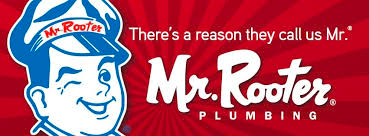
Observations:
- Red is a popular color for many brands.
- Red instills confidence in potential customers because it is used by other trusted brands.
- Most popular contrasting color is white.
- Blue can be combined with red and white without looking too “patriotic” (e.g. Mr Rooter).
Design Concepts – Round 4
1.

2.
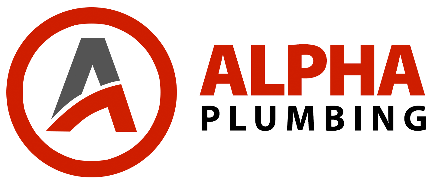
- We like #1 and #2. Is there a way that both could be used? The honeycomb design (#1) could make a great shirt, while the circle design could work well on a cap.
- Try combining elements – same font treatment, colors, etc.
- Also try and integrate the “A” logo type into the #1 honeycomb design.
Design Concepts – Round 3
1.

2.

3.
4.
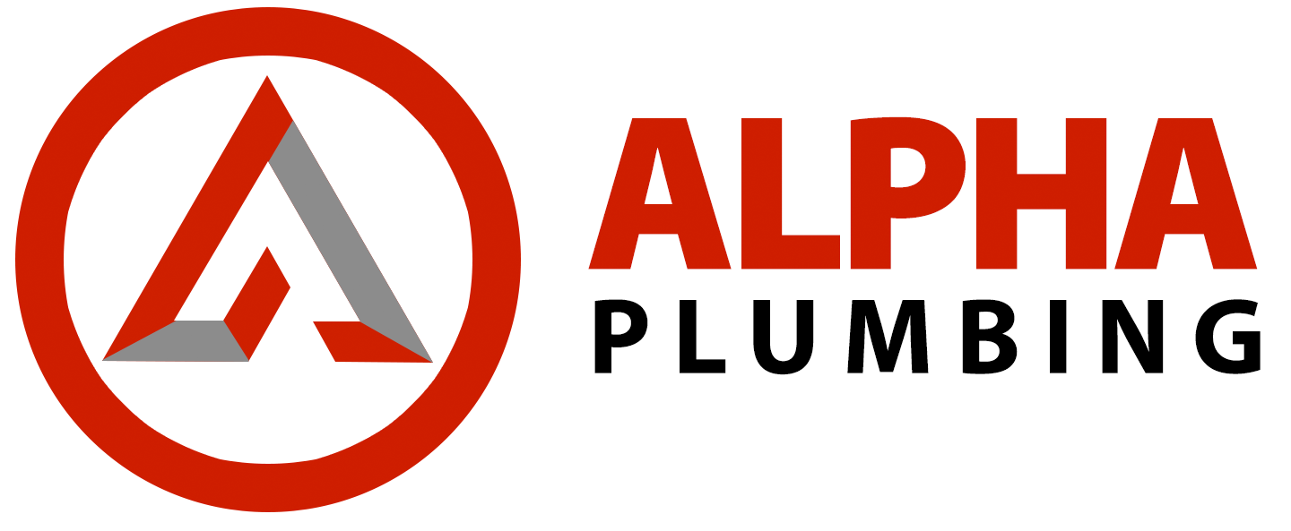
- Really like #1 and #3. Show us what #1 could look like with some gray integrated.
- Show us variations on #3.
Design Concepts – Round 2
1.

2.
3.
Design Concepts – Round 1
1.
2.

3.
- Not crazy about concept #1. Figure with folded arms looks unapproachable.
- Like the font used in this concept. Also like the pipe wrench graphics. The house shows that our main client base is residential.
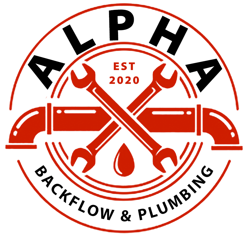
- Like the circle motif, would work well for shirts. Like the pipe graphic. Probably don’t want to use EST 2020. Water drop looks like blood.
Remove Backflow from logo designs. Name is simply Alpha Plumbing.
Overall, concept #3 is favorite. For next round, show a version of concept 3 with font from concept 2. Also try using pipe wrenches and maybe the house for the graphic elements. Also explore a few other design approaches not using an emblem.
